Fifteen years of brand stewardship for a Boston landmark
Park Street Church | Director of Communications, 2011–2021 | Consultant, 2023–Present
When I arrived at Park Street Church in 2011, the website, which was prime in its day, had become a patchwork of competing colors, dated graphics, and text-heavy pages that obscured the character of one of Boston's most significant historic landmarks. Over the next decade I led three distinct phases of brand and web evolution — each responding to where the organization was and what its audiences needed.

2012–2013 • Brand Refresh + Website Redesign
Logo + Identity
![]() In 2012 the need for a new logo and website was felt urgently. The change and expansion of ministries at Park Street had expanded beyond the capabilities of the 2006 website, and the old logo was outdated and insufficient for a vibrant, growing church. I oversaw a group of leaders in a brand strategy discussion, led by Daniel Vogelzang. We landed on a framework of "contradictions and complements." The logo needed to communicate a balance of opposites: classical yet modern, orthodox yet progressive, historic yet youthful, rooted in Boston yet reaching internationally, intellectually rigorous yet spiritually faithful.
In 2012 the need for a new logo and website was felt urgently. The change and expansion of ministries at Park Street had expanded beyond the capabilities of the 2006 website, and the old logo was outdated and insufficient for a vibrant, growing church. I oversaw a group of leaders in a brand strategy discussion, led by Daniel Vogelzang. We landed on a framework of "contradictions and complements." The logo needed to communicate a balance of opposites: classical yet modern, orthodox yet progressive, historic yet youthful, rooted in Boston yet reaching internationally, intellectually rigorous yet spiritually faithful.
A modern steeple icon won out as the shape that most expressed the contradiction and complement we were going for. In addition to being predominant in the previous logo, Park Street’s own steeple is an architectural icon — the tallest in the United States when it was built. Built around a ship's mast, its structure is both strong and flexible. We wanted to continue that legacy by claiming that shape as the symbol of the church community.
![]()
While the nature of a church steeple is inherently traditional, the simplicity of the shape of the new logo and the straightforward choice of typeface conveyed that Park Street is a church with a singular and unwavering focus: the Gospel of Jesus. The balance and contrast of heavy and light, light and dark, serif and sans serif type express our contradictory and complementary nature. The italic type in the byline “evangelical, congregational, international” leans forward with emphasis, showing movement and urgency. The interaction of the upper and lower shapes in the steeple itself and the architectural element of the cornice below gave a slight optical illusion of dimensionality, a hint towards the depth of scripture and of our community.
Website Redesign 2013
Simultaneously I worked with Iron to Iron, a two-person design studio, to redesign the website — moving from a cluttered, text-heavy site to one anchored by photography and clear hierarchy. The new website was built in Drupal, and recognized as best-in-class among church websites.
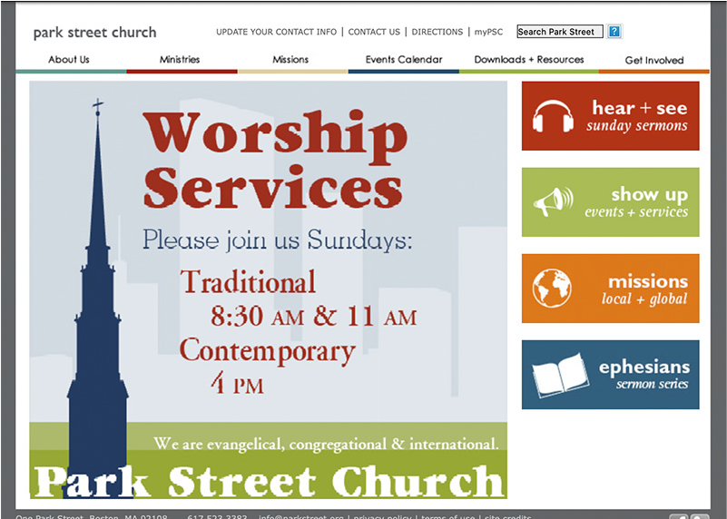
Screenshot of old website, circa 2009

Website homepage, 2013
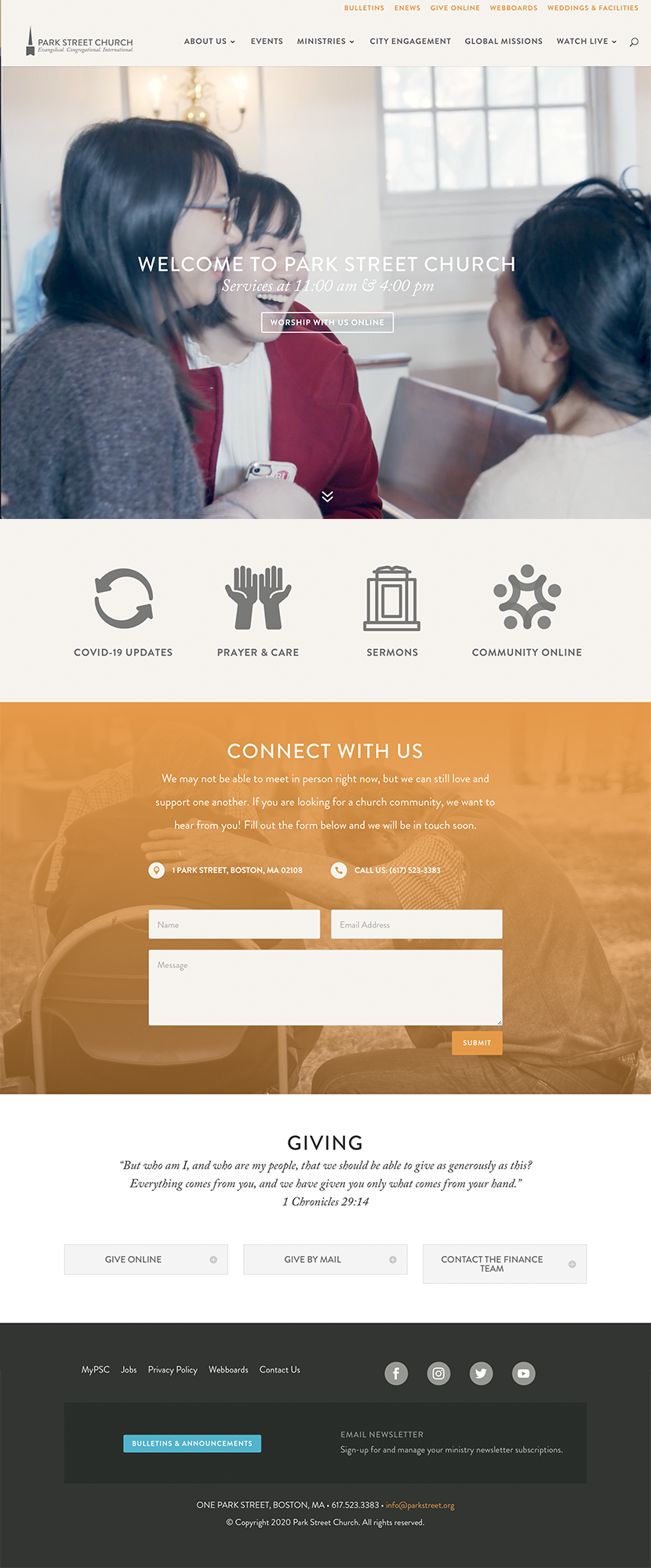
2020 · WordPress rebuild
Built in a crisis
The pace of change was so rapid that I was already in the process of refreshing and updating our site in 2020 when the world shut down because of Covid. I pivoted to WordPress for ease of use and rapidly rebuilt the site, prioritizing critical elements for the new digital landscape, especially the "watch live" page. I moved from PDF print-style bulletins to responsive HTML so congregants could see them easily, and to mimic an in-person experience. Video taken by Luke Zvara in February 2020 was fantastically timed, and added movement and emotion to our homepage.
Drag or scroll the image below to explore.
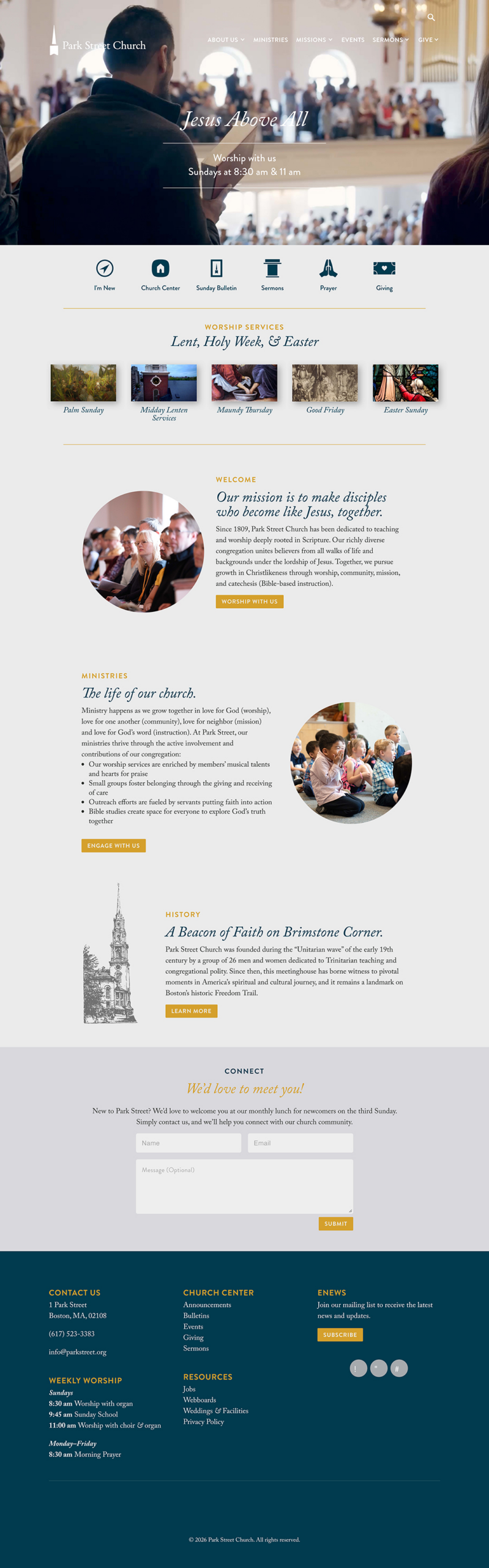
2025 · Brand Refresh
Another new beginning
Although I left my full-time position in 2021, I returned as a consultant in 2025. At that time I took cues from new leadership and leaned into a more refined look at feel. The logo symbol stayed the same, but I removed the tagline and adjusted the typeface and layout to improve balance and sophistication.
I cleaned up the navigation and structure of the website, but retained the 2020 framework. The colors moved from a brighter orange and turquoise to a more subdued and thoughtful gold and dark teal.
Drag or scroll the image below to explore.
This project is the clearest example of what I do: I sit at the intersection of institutional strategy and creative execution. I can lead a brand process with senior leadership, translate it into visual direction, manage designers, build a website, and steward the result over years. I've done it at the same organization across four iterations — and the brand got stronger each time.